Created by Kamila Klavíková
These are my notes about CSS and related stuff. I improve them as I get deeper understanding of CSS. last updated: 2022-12-23
Cascading Style Sheets
https://websitesetup.org/css3-cheat-sheet/
Unkommon CSS properties - some of them are not widely supported yet
Playground where you can try HTML and JS
micromata/awesome-CSS-learning
Ahmad Shaheed blog - interesting info
https://www.smashingmagazine.com/2019/01/how-to-learn-css/
https://www.smashingmagazine.com/2020/07/css-techniques-legibility/
Use relative units.
https://designmodo.com/html-css-emails/
ch the character unit is defined as being the “advanced measure” of the width of the zero character, 0, useful for setting width of a paragraph
ex is defined as the “x-height of the current font OR one-half of one em”.
em is defined as the current font-size. Problem is when you nest elements into each other. It computes size relatively to parent element. It is not usually what we want.
rem is similar to em, but it computes size from root element. It solves the problem we had before. Useful for font sizing and grids.
vh, vw (viewport height, viewportwidth) use viewport instead of parent element.
7 CSS Units You Might Not Know About
How to create printer-friendly pages with CSS
development tools
Tools for developers that are already in every modern browser.
To open them, right-click and select “Inspect” from the menu. If you are a keyboard person, shortcut Ctrl + Shift + I will work in most browsers.
CSS Stats provides analytics and visualizations for your stylesheets. This information can be used to improve consistency in your design, track performance of your app, and diagnose complex areas before it snowballs out of control.
Good for creating an overview of colors.
https://caniuse.com is a site where you can search the CSS propertity support in browsers.
https://css-tricks.com/methods-organize-css/
https://developer.mozilla.org/en-US/docs/Learn/CSS/CSS_layout
https://www.tothenew.com/blog/10-best-practices-in-css/
https://www.webfx.com/blog/web-design/css-methodologies/
We Write CSS Like We Did in the 90s, and Yes, It’s Silly
https://developer.mozilla.org/en-US/docs/Learn/CSS/Building_blocks/Cascade_and_inheritance
Only some elements inherit properties from their parents.
If you want to inherit the property that's not inherited by default, use property: inherit,
Great article about specifity on Smashing Magazine
https://stackoverflow.com/questions/12258596/class-overrule-when-two-classes-assigned-to-one-div
Inheritance also needs to be understood in this context — some CSS property values set on parent elements are inherited by their child elements, and some aren't.
Specificity is one of the main forces at work when the browser decides how CSS affects the page. The more specific a selector is, the more importance is added to it. This usually coincides with how often the selected element occurs. For example:
button {
  color: black;
}
button.highlight {
  color: blue;
  font-size: 1.5em; }
button#buyNow {
  color: green;
  font-size: 2em;
}
On this page, all buttons are black. Except the buttons with the class "highlight", which are blue. Except that one unique button with the ID "buyNow", which is green. The importance of the entire rule (both the color and font-size in this case) is managed by the specificity of the selector.
!important, however, is added at a property level, not a selector level. If, for instance, we used this rule:
button.highlight {
  color: blue !important;
  font-size: 1.5em;
}
then the color property would have a higher importance than the font-size. In fact, the color is more important than the color in the button#buyNow selector, as opposed to the font-size (which is still governed by the regular ID vs class specificity).
An element <button class="highlight" id="buyNow"> would have a font-size of 2em, but a color blue.
This means two things:
!important declaration, for example in the button#buyNow selector.This not only makes your stylesheets a lot harder to maintain and debug, it starts a snowball effect. One !important leads to another to override it, to yet another to override that, et cetera. It almost never stays with just one. Even though one !important can be a useful short-term solution, it will come back to bite you in the ass in the long run.
The order is important, otherwise it might not work as expected.
a:visited { color: purple; }a:focus { background: lime; }a:hover { background: grey; }a:active { background: darkgrey; }This is what !important was invented for in the first place: to give the user a means to override website styles. It's used a lot by accessibility tools like screen readers, ad blockers, and more.
sometimes called a tag or type selector
Element selector selects all HTML elements of the specified type.
p selects <p>
Generally I'd say this is a case of code smell, but sometimes you just have no option. As a developer, you should aim to have as much control over your code as possible, but there are cases when your hands are tied and you just have to work with whatever is present. Use !important sparingly.
Many libraries and frameworks come with utility classes like .hidden, .error, or .clearfix. They serve a single purpose, and often apply very few, but very important, rules. (display: none for a .hidden class, for example). These should override whatever other styles are currently on the element, and definitely warrant an !important if you ask me.
Using the !important declaration is often considered bad practice because it has side effects that mess with one of CSS's core mechanisms: specificity. In many cases, using it could indicate poor CSS architecture.
There are cases in which it's tolerable or even preferred, but make sure you double check that one of those cases actually applies to your situation before using it.
Keyword added to a selector that specifies a special state of the selected element(s), i. e. :hover, :active, :first, :nth-child...
ID selector selects one element on the page with the specified ID. On a given HTML page, each id value should be unique.
#my-id selects <p id="my-id"> or <a id="my-id">
Class selector selects elements on the page with the specified class. Multiple instances of the same class can appear on a page.
.my-class selects <p class="my-class"> and <a class="my-class">
It has set display: inline by default. Because of that, changing height and weight won't have any effect.
Set content property before you do anything else. Without content the pseudo-element won't show.
Attribute selector selects the elements on the page with the specified attribute.
img[src] selects <img src="myimage.png"> but not <img>
More about attribute selectors on MDN web docs
A combinator is something that explains the relationship between the selectors.
https://www.digitalocean.com/community/tutorials/how-to-style-a-table-with-css - a really great tutorial, guides you with examples
https://css-tricks.com/complete-guide-table-element/ - a complete guide on CSS tricks
table-layout: fixed to create a more predictable table layout that allows you to easily set column widths by setting width on their headings (<th>).border-collapse: collapse to make table elements borders collapse into each other, producing a neater and easier to control look.<thead>, <tbody>, and <tfoot> to break up your table into logical chunks and provide extra places to apply CSS to, so it is easier to layer styles on top of one another if required.text-align to line up your <th> and <td> text, to make things neater and easier to follow.Source: https://developer.mozilla.org/en-US/docs/Learn/CSS/Building_blocks/Styling_tables
A CSS pseudo-element is used to style specified parts of an element.
For example, it can be used to:
p::first-line {
   color: #ff0000;
   font-variant: small-caps;
}
p:first-child::first-line will choose the first line of the first-child paragraph
The z-index property defines the order of the elements on the z-axis. You can apply it to elements with a position value other than static.
Positioned elements appear in front of non-positioned ones.
Z-index works only within an element's stacking context. If you try to set a z-index on an element with no position specified, it will do nothing.
https://ishadeed.com/article/understanding-z-index/ – great article, simple explanation with pictures
https://codersblock.com/blog/deep-dive-into-text-wrapping-and-word-breaking/
A really good article about he various ways we can control how text wraps (or doesn’t wrap) on a web page. It's detailed.
https://material.io/ - main page
Google Material Design: A cheat sheet for professionals
https://www.sitepoint.com/10-essential-material-design-resources-and-tutorials/
It's a parent that contains one or more elements. Those elements will be stacked according to the source order rules, and their z-index values only have meaning within their parent.
A few examples on triggering a new stacking context(s):
As a general rule, it seems that if a CSS property requires rendering in an offscreen context, it must create a new stacking context.
https://www.smashingmagazine.com/2021/02/css-z-index-large-projects/
It's using variables to show how are Z-indexes related.
Name contains stacking context and element.
https://www.smashingmagazine.com/2014/06/sassy-z-index-management-for-complex-layouts/
Another approach using lists of elements that serve as a source order. Z-index is created as an index of the element in the list.
The pro is you can easily change the order.
Both system make clear how the Z-indexes are related. Z-indexes easily become problem in bigger projects. If your Z-indexes are chaos, you end up with arbitary high values such as 9999.
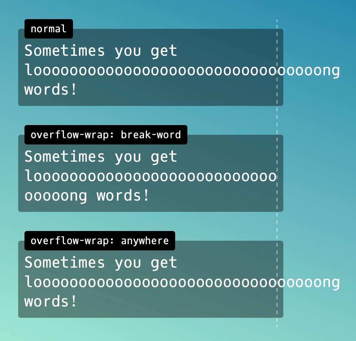
overflow-wrap can break a line of text in otherwise breakable space. This prevents an unusually long string of text from causing layout problems caused by overflow.
Values:
normal,break-word,anywhere.https://blog.logrocket.com/guide-word-wrap-overflow-wrap-word-break-css/ (last visited 2022-12-23)
https://unused-css.com/blog/text-wrapping/ (last visited 2022-12-23)
The children of a stacking context are stacked from bottom to top in the following order:
Higher values are stacked in front of lower values; elements with the same value are stacked according to appearance in the HTML.
If you’re looking for the full stack order, please read the spec.
overflow-wrap: anywhere and overflow-wrap: break-word vary in the calculation of internal min-content sizes.
overflow-wrap: anywhere – Break between any 2 characters where the overflow occurs and consider soft wrap opportunities when calculating the min-content intrinsic sizes. overflow-wrap: anywhere calculates the min-content with all the breaks it can create. Since a break can appear anywhere, min-content equals the width of one character.
overflow-wrap: break-word – Break between any 2 characters but do not consider soft wrap opportunities when calculating the min-content intrinsic sizes. overflow-wrap: break-word calculates min-content as if no words were broken, so the width matches the width of the longest word.
https://codersblock.com/blog/deep-dive-into-text-wrapping-and-word-breaking/ (last visited 2022-12-23)
Původně vymyšlený na obtékání obrázku. Tak by to mělo i zůstat.
float: left | right
Exciting things on the horizon for css layout
Learn CSS layout the pedantic way
A fancy name for places where text would break naturally, such as between words or after a hyphen.
Not all text have soft wrap opportunities, e. g. really long words or URLs.
This leads to various layout issues.
https://codersblock.com/blog/deep-dive-into-text-wrapping-and-word-breaking/ (last visited 2022-12-23)
The main axis is set using flex-direction. The cross axis is then perpendicular to it..
Options of flex-direction:
columncolumn-reverserowrow-reversehttps://www.w3schools.com/css/css_boxmodel.asp
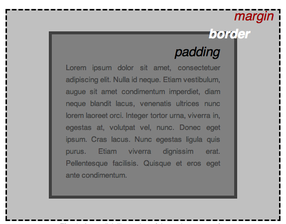
Main component of CSS layout.
Each box has properties like:
Content. The content of the box, where text and images appear
Padding. The space around the content.
Border. The border that goes around the padding and contetn.
Margin. Clears an area outside the border.
If we change the natural size of an element by applying a value to it, we call this size extrinsic.
https://blog.logrocket.com/understanding-min-content-max-content-fit-content-css/ (last visited 2022-12-23)
It is when the content defines the element size.
https://blog.logrocket.com/understanding-min-content-max-content-fit-content-css/ (last visited 2022-12-23)
Elements such as button , fieldset , and summary don’t work as flex containers. The flexbox repository gives the following reason:
A workaround is to wrap the inputs in another element that can act as a flex container.
The button element bug is fixed in Chrome, Firefox, and Safari.
Simple visual flexbox cheatsheet
You can use both for creating similar layouts. They adapt to the screen size.\
The rule is that if you are adding width to flex items to get them to line up with items above them, then using the grid would be a better solution.
| Flexbox | Grid |
| 1D | 2D |
| creates a container, sets the direction and size on each item | sizes mostly at the container level |
Relationship of grid layout to other layout methods
Relationship of flexbox to other layout methods
Responsive grids and how to actually use them: common UI layouts
Good for forms, for example.
Defining padding using % is tricky. You need to remember that it's calculated from the width of the element.
Vertical margins are not applied to inline elements such as span.
Oblast dokumentu rozvržená pomocí flexboxu. Vytvoří se nastavení display na flex nebo inline-flex.
The direct descendants of the flex container become flex items.
Default settings:
https://css-grid-layout-generator.pw/
The tool makes available tons of settings, both for the Grid container and the Grid items. Available features include:
grid-gap propertyjustify-items, align-items, justify-content, align-contenthttps://ethanmarcotte.com/wrote/css-grid-without-max-width/
When you set the width and height properties of an element with CSS, you just set the width and height of the content area.
full size of an element = width or height + padding for both sides + border for both sides + margin for both sides
https://css-tricks.com/box-sizing/
Values
Border box
full size of an element = width or height of the content
Indicates how the element is displayed.
The clock
Top Right Bottom Left
Top and bottom margin sometimes collapse. Thus, mixing them leads to problems. Use one-directional margins, i. e. margin-bottom, for all elements.
Flexbox margins don't collapse.
Pokud máme elementy, kde margin-bottom jednoho je stejný jako margin-top druhého, tak je to jedna hodnota.
Př.
.a { margin-bottom: 8px; }
.b { margin-top: 8px; }
Výsledný margin je 8 pixelů.
Pokud se velikosti marginů liší, vezme se ten větši z nich.
Př.
.a { margin-bottom: 16px; }
.b { margin-top: 8px; }
Výsledný margin je 16 pixelů.
https://tobiasahlin.com/blog/layered-smooth-box-shadows/
https://alligator.io/css/box-shadow-examples/
box-shadow: x-coordinate y-coordiate blur content-blur color
You want to fill colors as rgba so you can set alpha channel. Shadows look better and more realistic then.
Nemusí být špatná kombinace s tenkým rámečkem podobné barvy jako stín. Může vypadat dobře zabarvený stín oproti klasické černé.
x <= y <= blur
You can layer shadows. Groups of parameters are divided by commas. This is how are shadows in Material Design are done.
- Use a more blue color than black for the shadow, which mimics the illumination of the blue sky you see in shadows on sunny days. https://www.cgchan.com/static/store/img/sceneskies/sharp_shadows.jpg
- If using a colored (rather than white) background, add some of the color of the background in the shadow. Once again, global illumination looks more pleasing. https://i.ytimg.com/vi/EErZndeF5zI/maxresdefault.jpg
https://www.youtube.com/watch?v=jsCr0WPKRhw
By the W3C specifications, the min-content is the smallest size a box can take without overflowing its content.
By the W3C specifications, max-content is the ideal frame size on a given axis if infinite space is available.
https://blog.logrocket.com/understanding-min-content-max-content-fit-content-css/ (last visited 2022-12-23)
Many examples, useful diagrams for explaining keywords.